Set up a creative concept to illustrate the Poitou-Charentes region and its architecture, and apply it to print and digital material.
Challenge
Find a relevant creative approach and a symbolism accessible to the general public.
Solution
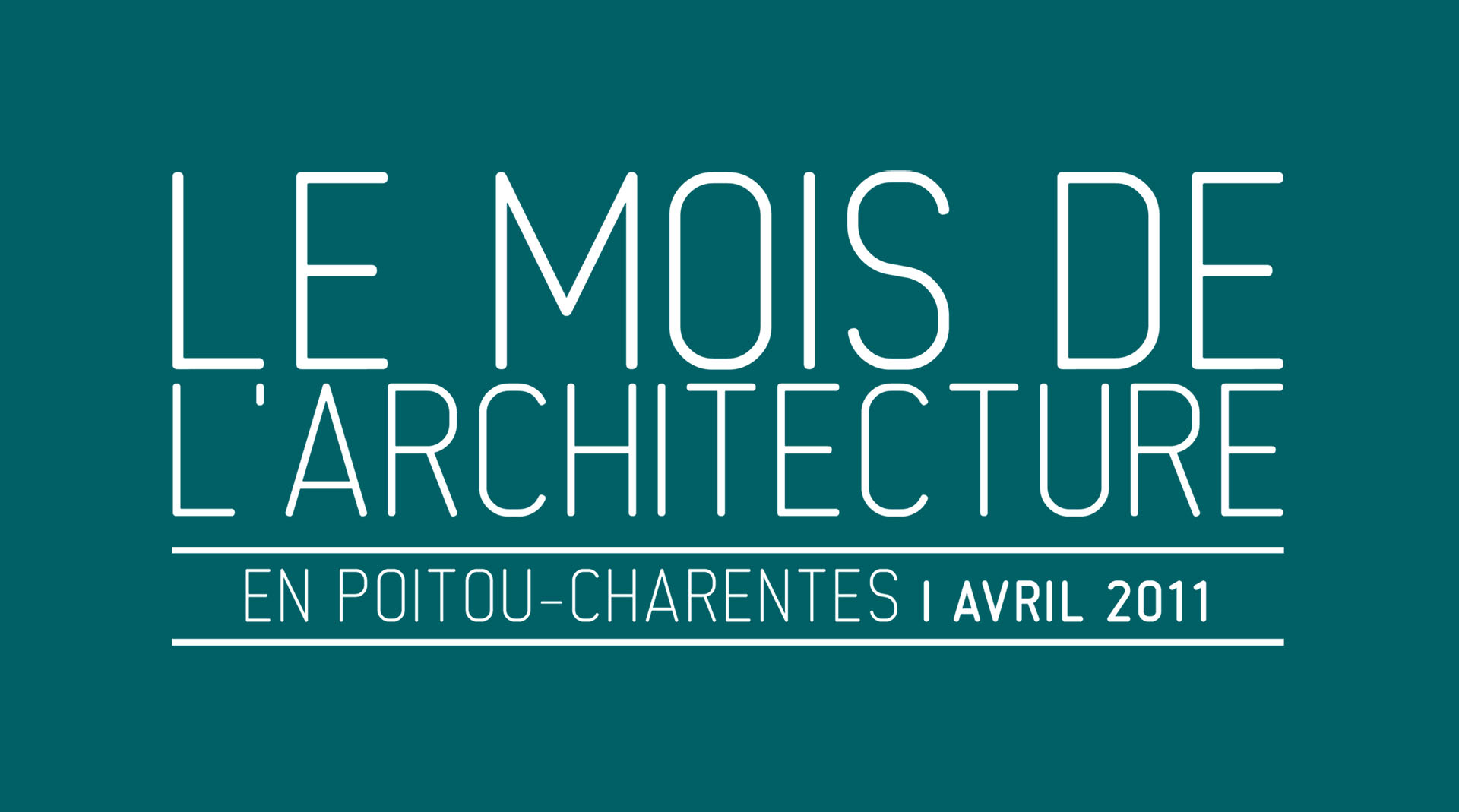
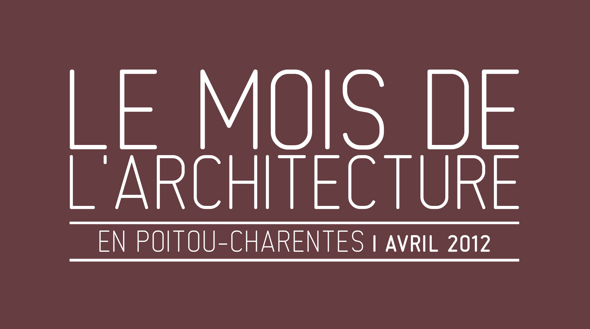
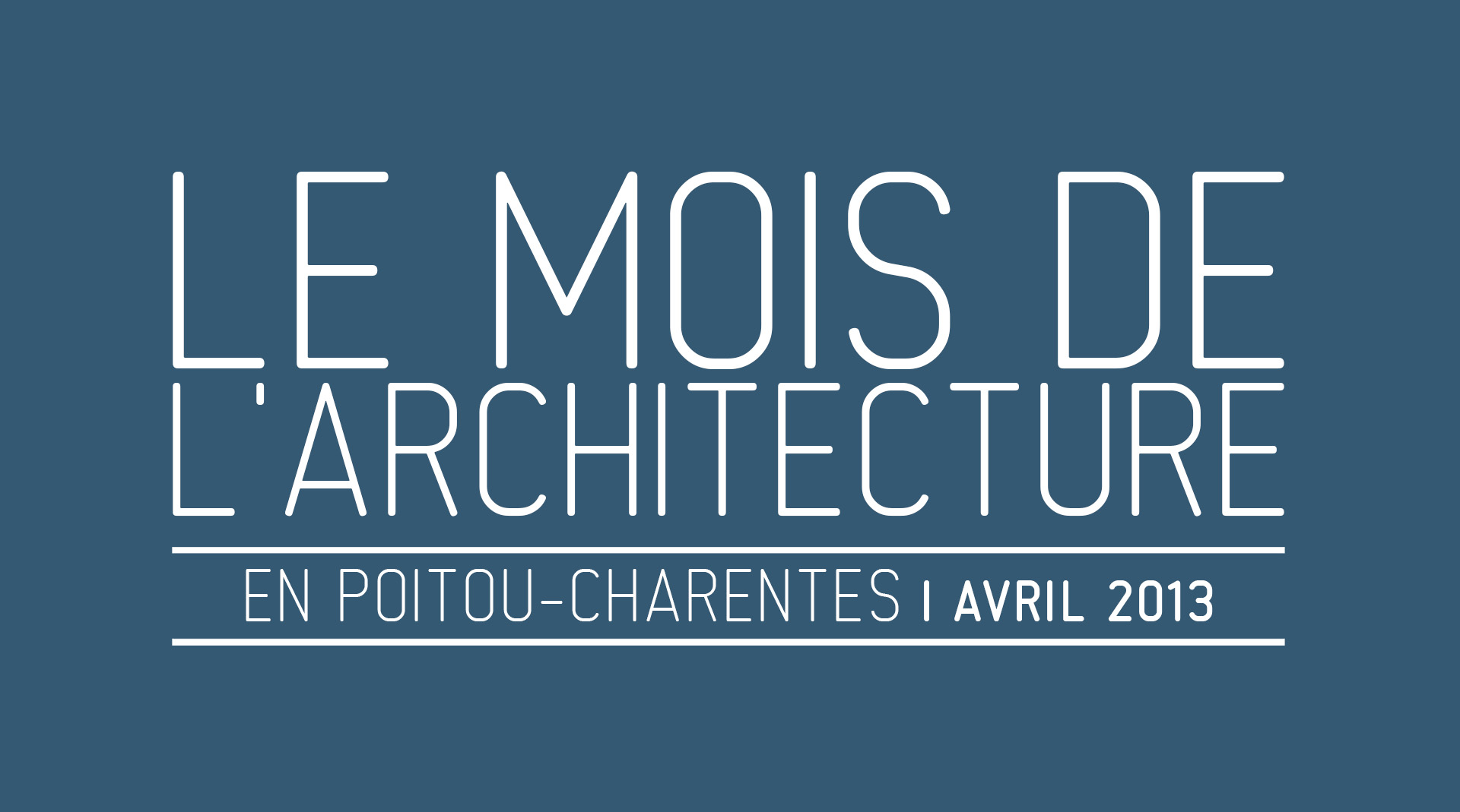
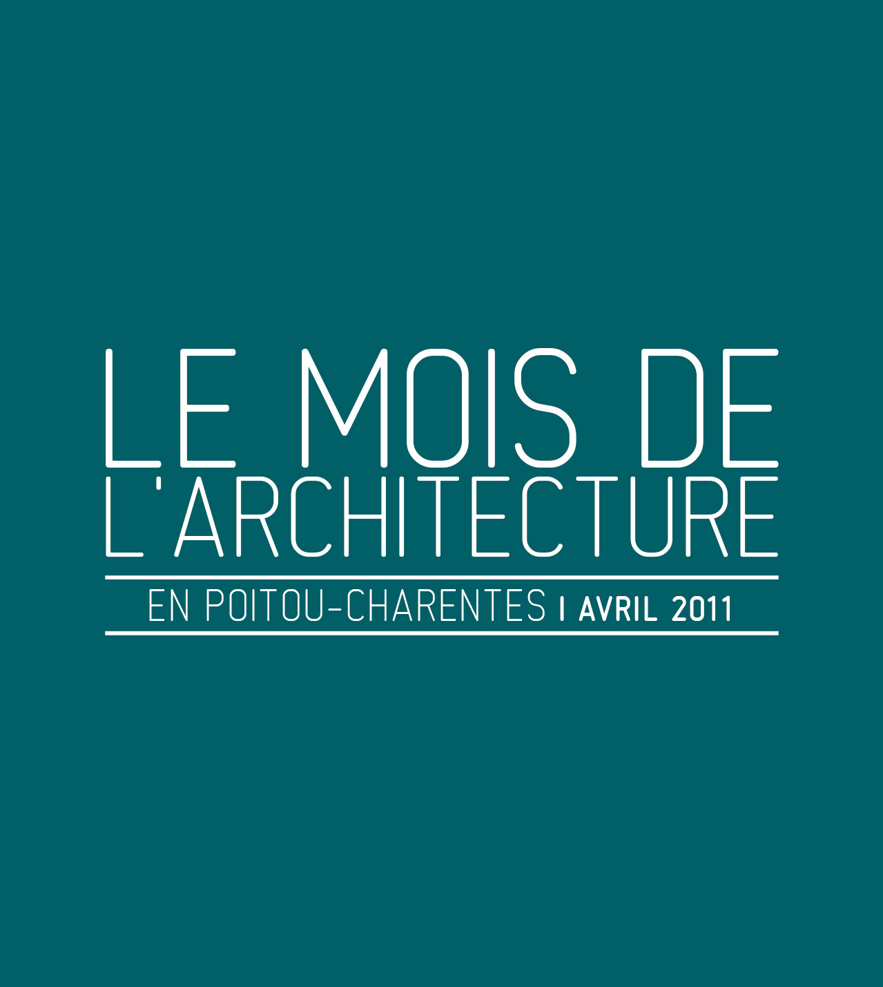
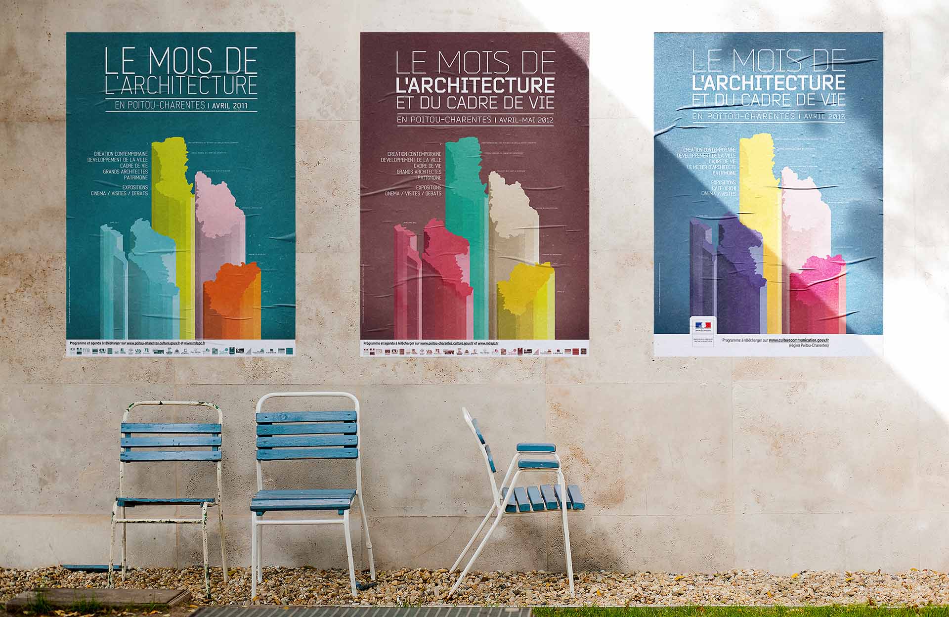
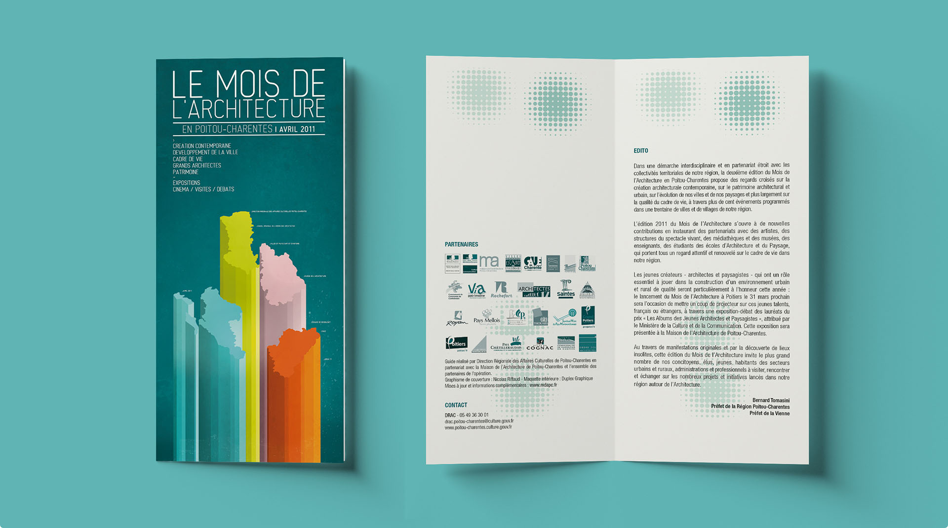
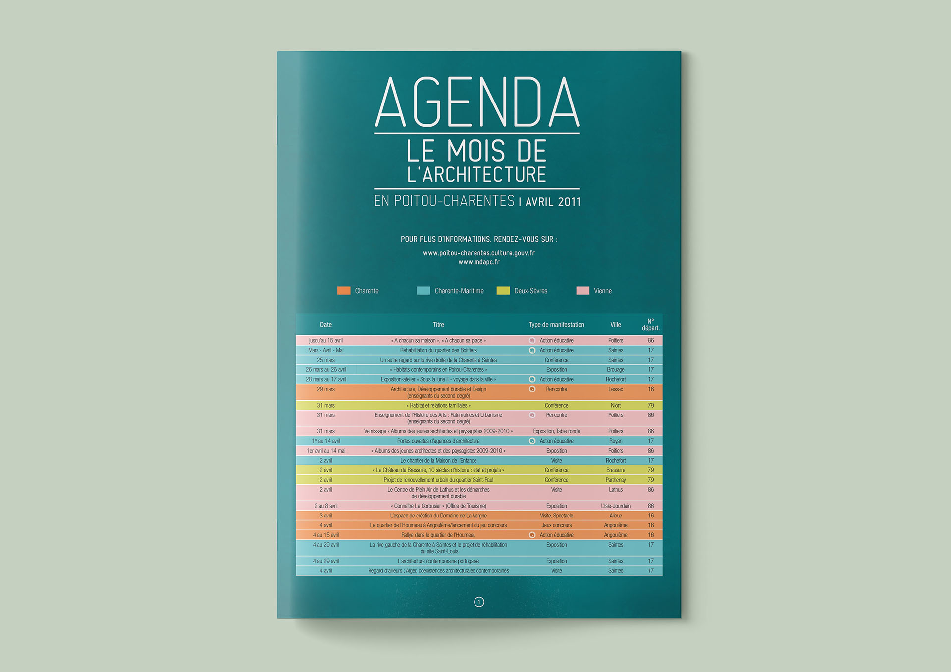
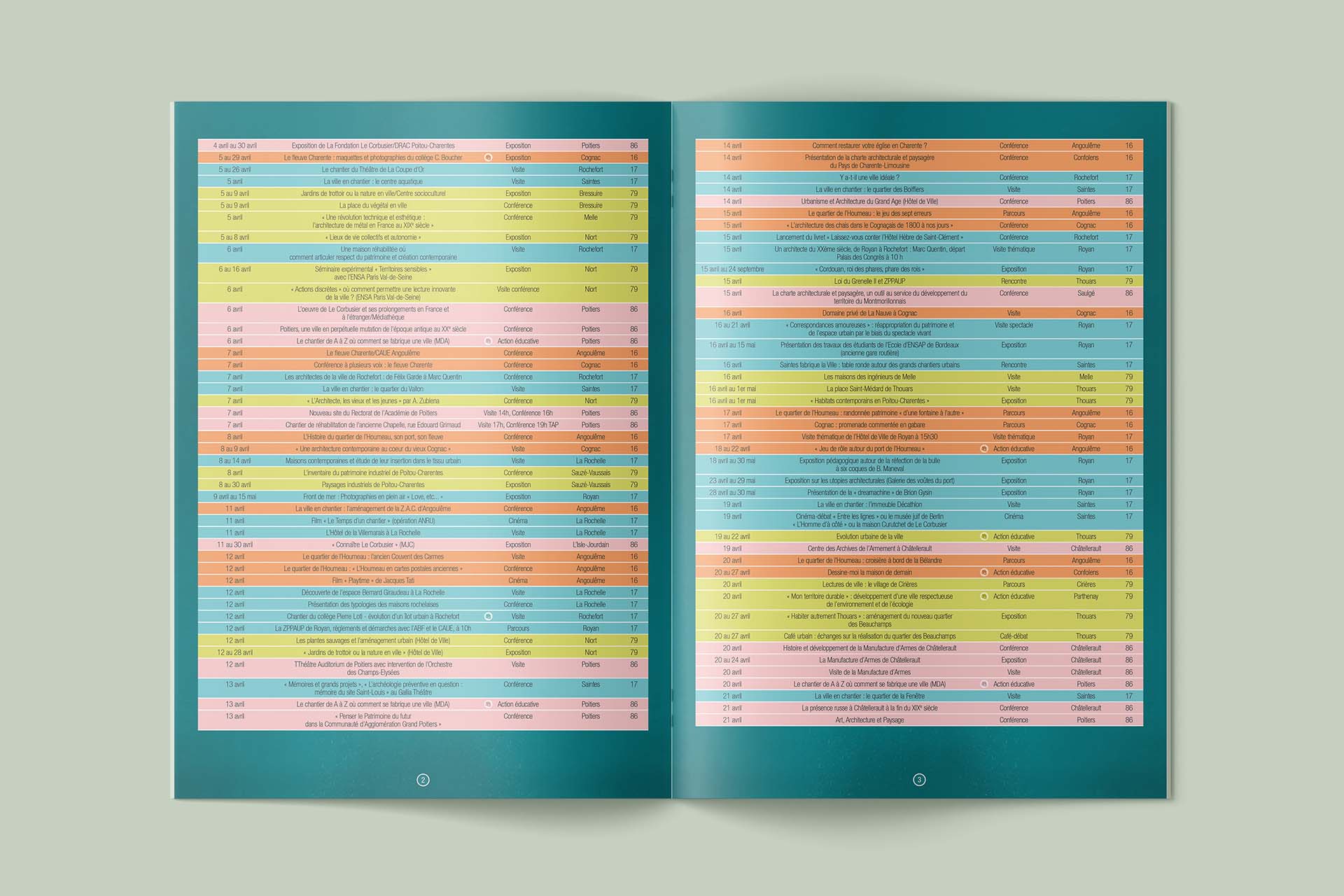
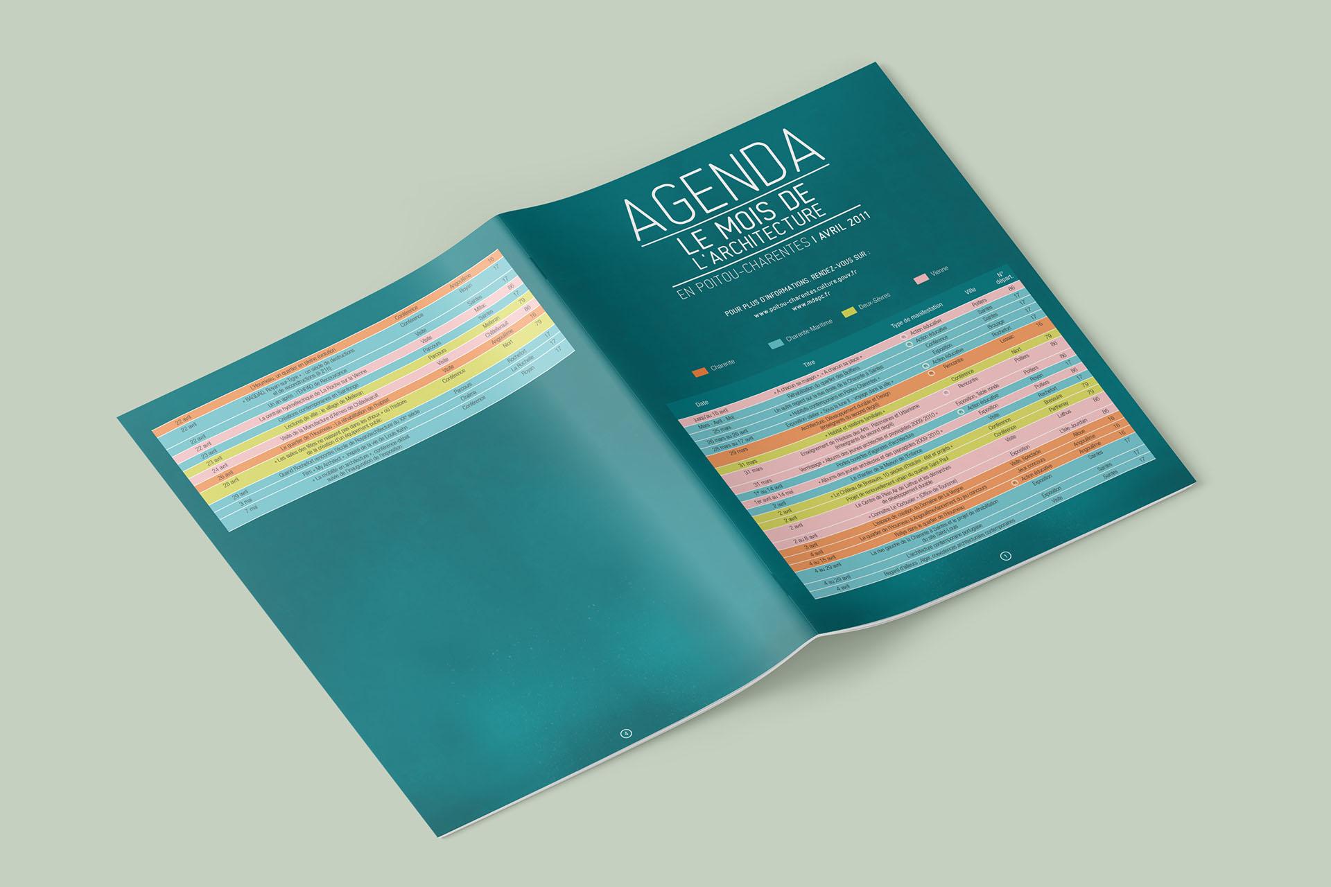
Highlighting the 4 departments and associating each with a color was the solution chosen to extend the campaign beyond one season.
What are we talking about?
I supported the DRAC Nouvelle-Aquitaine over several years, as part of an institutional communication campaign aimed at highlighting contemporary architecture, architectural heritage and urban development, the evolution of cities and landscapes and also the quality of the living environment through events spread throughout the Poitou-Charentes region.
client
DRAC Nouvelle-Aquitaine
project
360° communication campaign
role
creative direction, graphic design
deliverable
digital, print
What are we talking about?
I supported the DRAC Nouvelle-Aquitaine over several years, as part of an institutional communication campaign aimed at highlighting contemporary architecture, architectural heritage and urban development, the evolution of cities and landscapes and also the quality of the living environment through events spread throughout the Poitou-Charentes region.
The key idea behind the concept was the 3D extrusion of the 4 departments of the Poitou-Charentes region, to give each one its own relief and prominence.
The association with a color code made it possible to better distinguish them and articulate the content according to the programming of events by department.
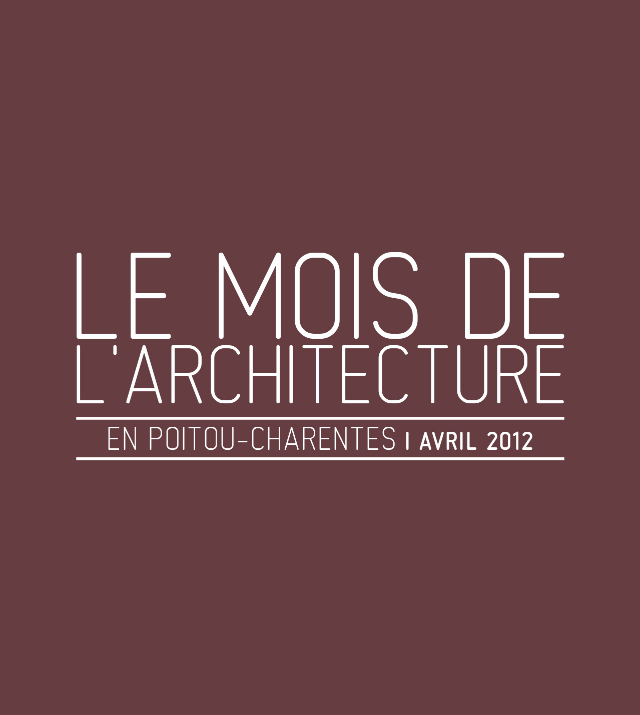
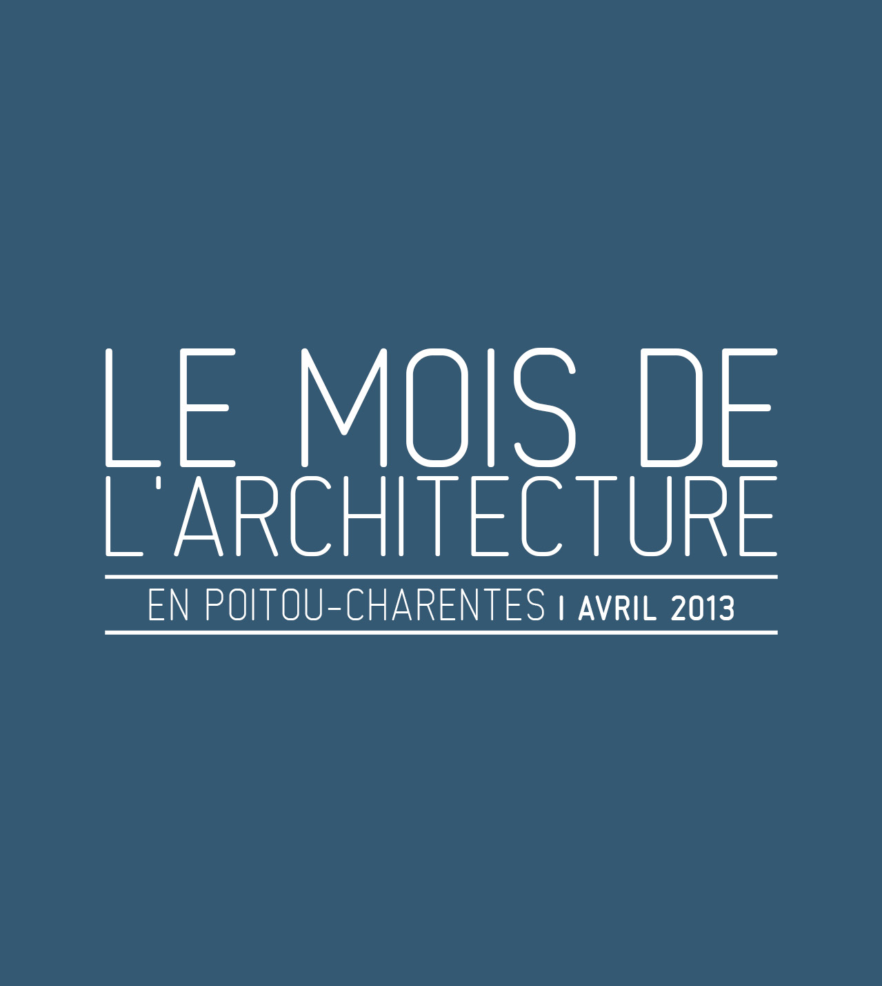
As for the typography, we chose an art deco style to give a strong identity to the visual direction of the campaign.
Concept
The key idea behind the concept was the 3D extrusion of the 4 departments of the Poitou-Charentes region, to give each one its own relief and prominence. The association with a color code made it possible to better distinguish them and articulate the content according to the programming of events by department.
As for the typography, we chose an art deco style to give a strong identity to the visual direction of the campaign.