20 years of cultural buildings in Poitou-Charentes
Cultural exhibition
Objective
Demonstrate that in the two decades from 1990 to 2010, the construction of museums, auditoriums, libraries and media libraries has not died out in Poitou-Charentes, but on the contrary.
Challenge
Breaking free from consensual formats and striking the right balance between an identity with a strong personality and an impactful scenography that can be installed in different exhibition venues.
Solution
Showcase the richness and cultural diversity of a region through a modern, colorful and assertive graphic design, freeing itself from all classicism to best reflect these monuments.
What are we talking about?
This is an exhibition designed and produced by the Maison de l’Architecture and the Conseil Régional de l’Ordre des Architectes de Poitou-Charentes. It presents 30 emblematic cultural buildings of the region over the past 20 years: theaters, museums, media libraries, performance halls… The Maison de l’Architecture called on me to manage the creative direction and graphic design of the exhibition.
client
Maison de l’Architecture de Poitou-Charentes
project
architecture exhibition
role
creative direction, design
deliverable
visual identity, digital, print, motion, signage
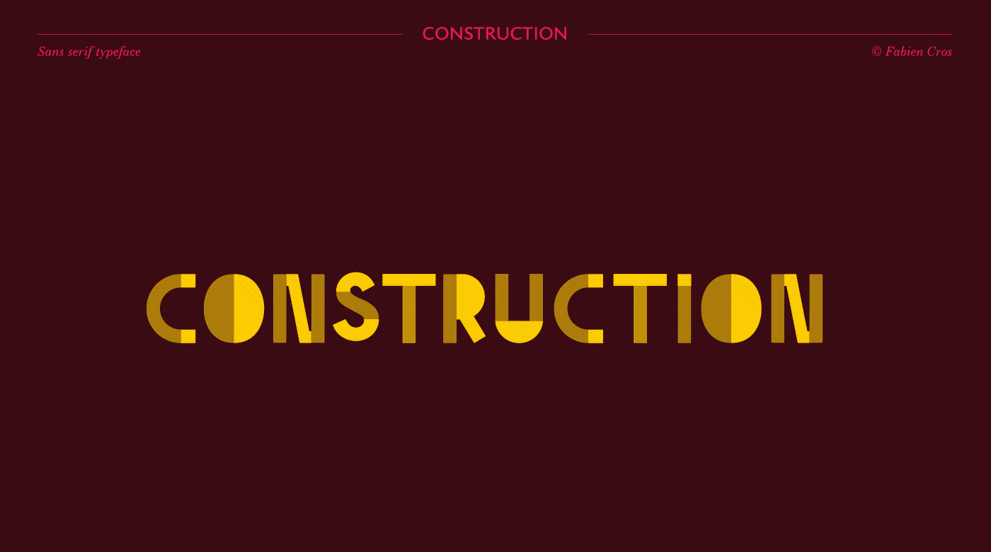
Logo concept
My proposal was to draw a unique typography with the aim of defining the bases of visual identity. The main goal was to bring a strong, recognizable and singular element.
So I choose for a contemporary, modern, sans-serif style, inspired by the architecture theme. A construction game of geometric shapes, associating 2 shades (or material effects), one full and one transparent. A wink to the choice of materials that an architect must make in each of his projects. It is for all these reasons, I chose to name this font « Construction ». A word that symbolizes it well.
Naturally, once created, I used this one for the logo design and as a common thread for the exhibition. It has indeed greatly influenced my graphic choices on all the materials created.
Colors
I decided to combine 2 bright, contrasting, dynamic colors in order to more easily attract the attention of visitors and support my visual direction and graphic choices. Each combination illustrates one of the 4 departments in the region to distinguish projects by location.
Colors
I decided to combine 2 bright, contrasting, dynamic colors in order to more easily attract the attention of visitors and support my visual direction and graphic choices. Each combination illustrates one of the 4 departments in the region to distinguish projects by location.
Sceno
Each building was defined combining horizontality and verticality for the presentation of each building. The layout allows you to discover them as you go along. The choice of hanging the canvases was deliberate, in order to gain in lightness while positioning the contents at eye level for easy reading.
Credits
MDAPC and the Conseil Régional de l’Ordre des Architectes (exhibition curator), Fabien Cros (creative direction / design), Jean-Pierre Ulhen (scenography), Richard Porteau – FRAC ANGOULEME, Fred Lelan – MEDIATHEQUE MICHEL CREPEAU + LA SIRENE, Atelier du patrimoine – GALLIA, Vincent Monthiers – CERIZAY, Camille Lagrange – VERDIERE, Francis Giraudon – MUSEUM D’HISTOIRE NATURELLE, Ivan Franic & Michel Garcin – Asa architectes et associes Paris – NEF, Synchro-X – THEATRE ANGOULEME, Arthur Péquin – TAP, Cyril Bruneau, Alberto Bobos, Philippe Metifet – BANDE DESSINEE, PLF B.Osso – HEBRE, Musée Bernard d’Agesci – AGESCI, Fernando Javier Urquijo – BOUGON, Nathalie Fixon – MUSEE ANGOULEME (photography)
Maison de l’architecture de Poitou-Charentes – Académie Alvar-Aalto – Association finnoise des architectes SAFA – Musée de l’architecture finnoise (exhibition curator), Fabien Cros (creative direction / design), Jean-Pierre Ulhen (scenography), Selina Anttinen – Heikki Aitoaho – Johan Celsing – Tapio Aho – Maija Kasvio (Jury), Arno de la Chapelle – Matti Huhtamies – Marko Huttunen – Matti Kallio – Hannu Koivisto – Noritsu Koki – Kai Kuusisto – Antti Laiho – Lauri Louekari – Kalervo Ojutkangas – Kari Palsila, Michael Perlmutter, Kimmo Räisänen – Jyrki Tasa – Jussi Tiainen – Tuomas Uusheimo – Timo Vesterinen – Mika Vuoto (photography)