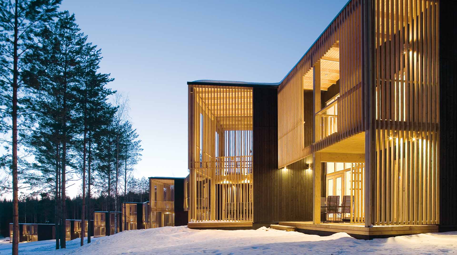
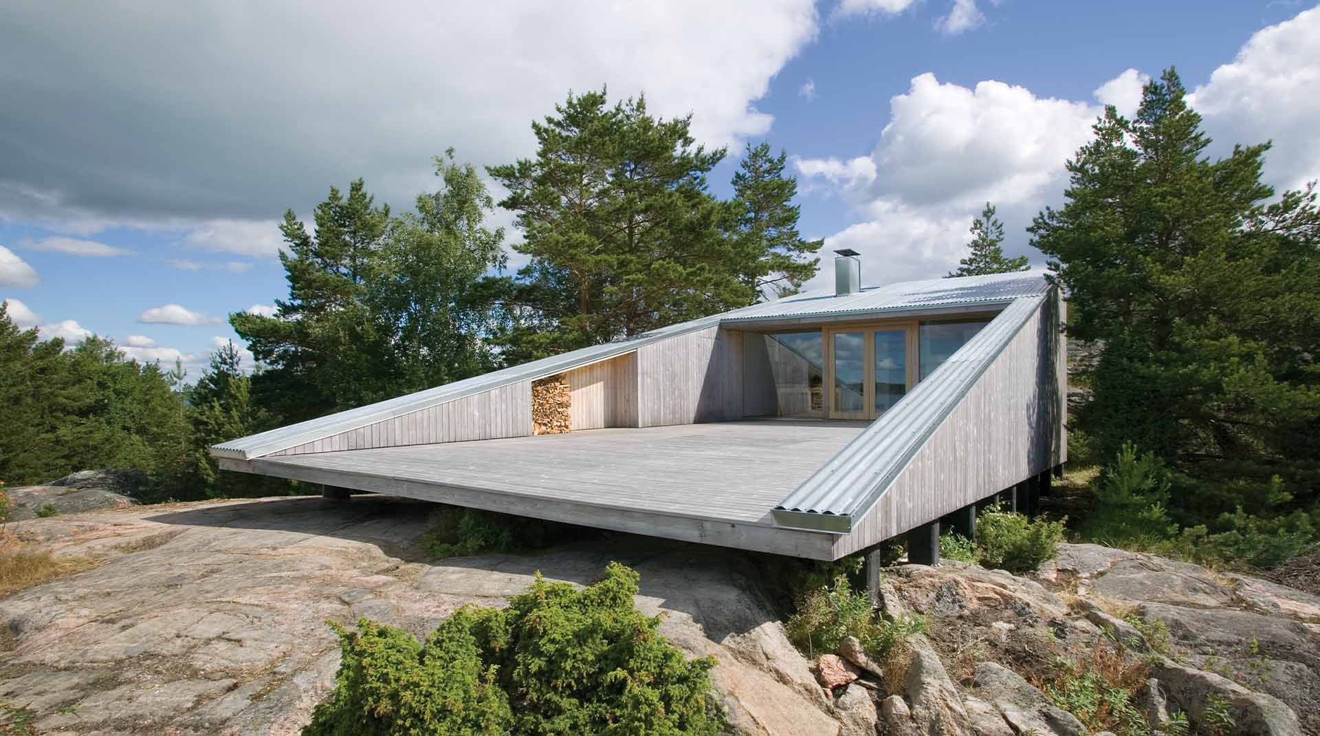
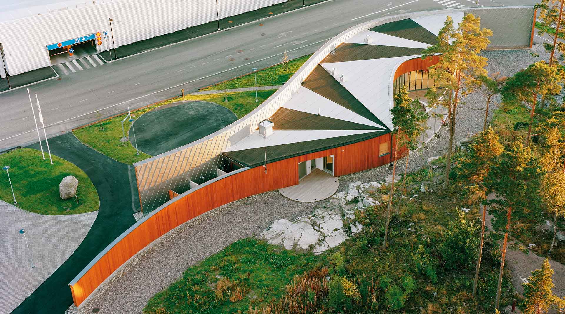
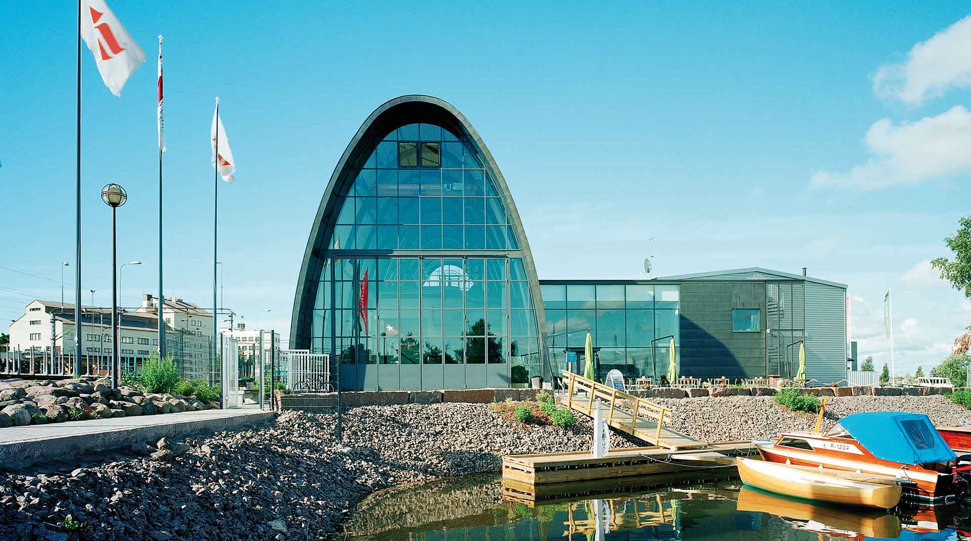
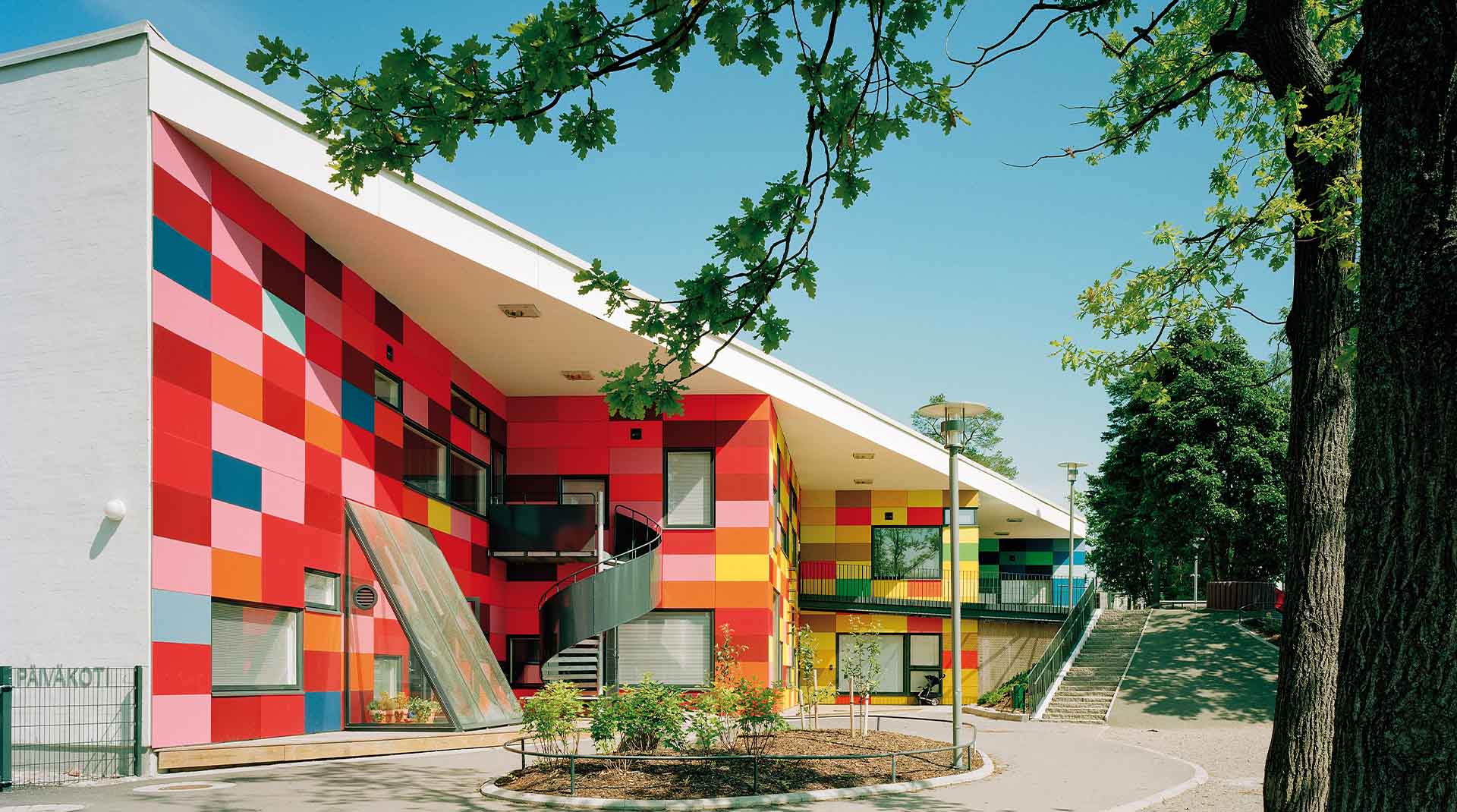
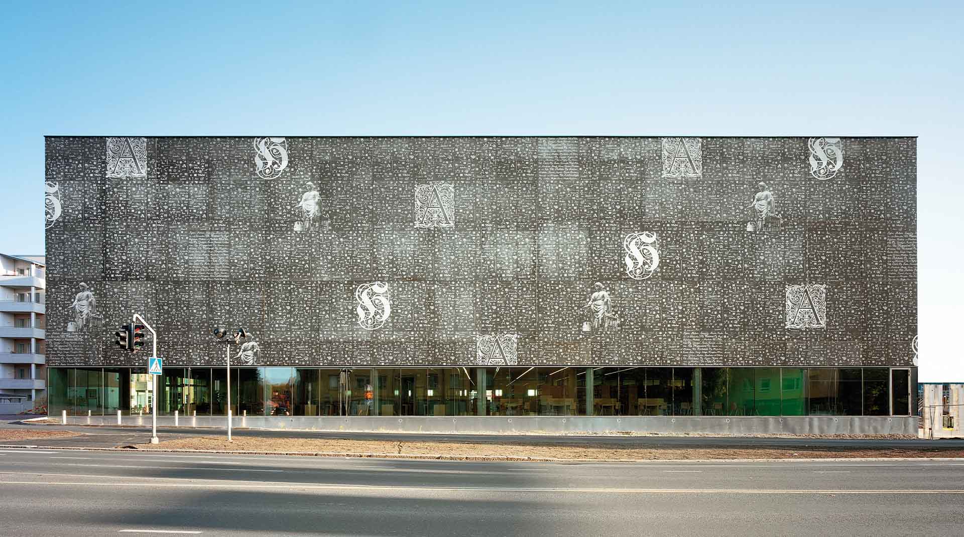
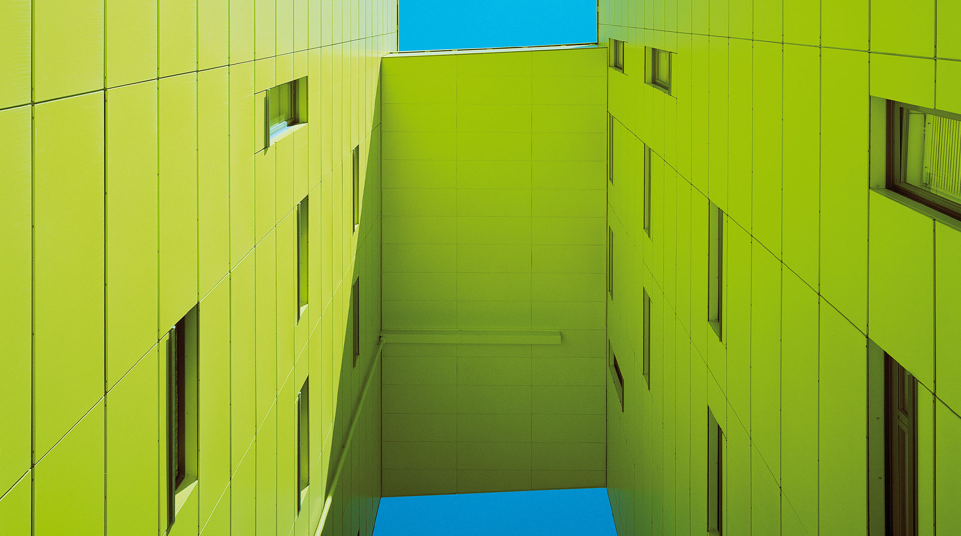
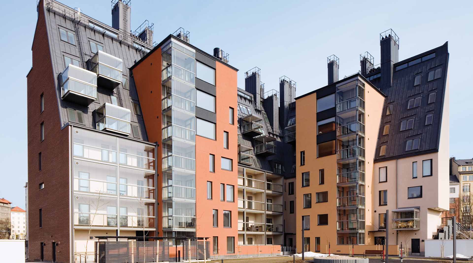
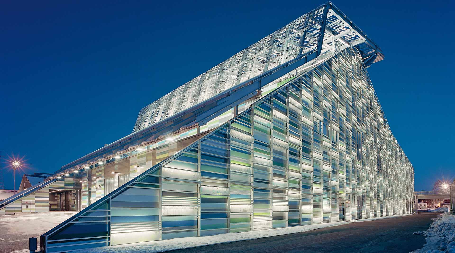
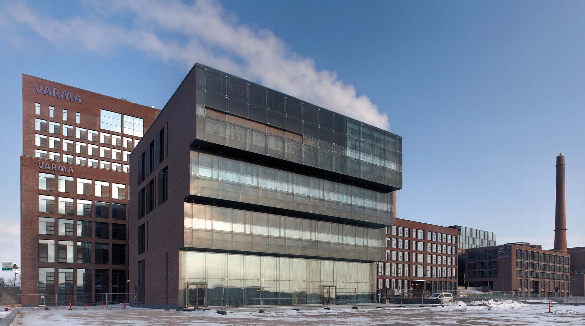
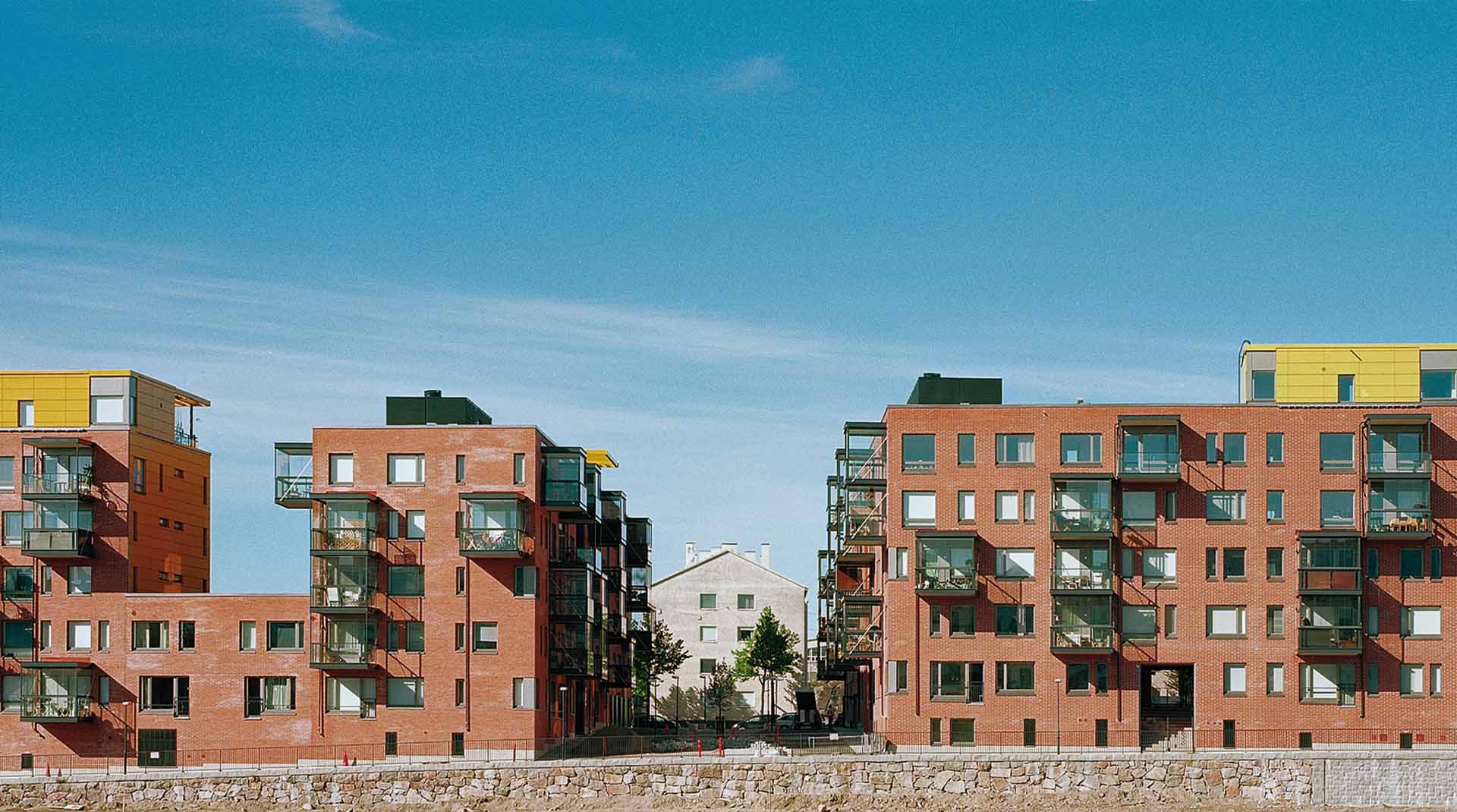
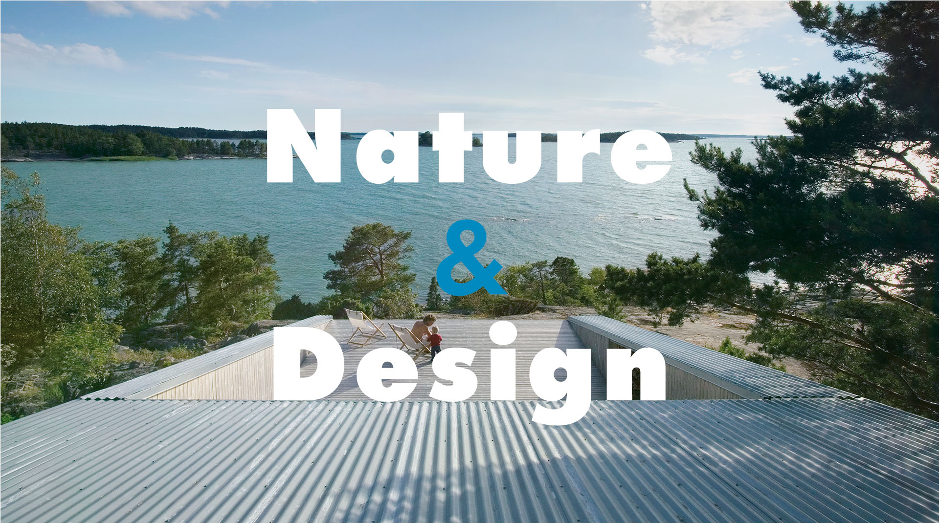
Highlight the diversity of modern Finnish architecture and its integration into its environment.
Challenge
Breaking free from consensual formats and striking the right balance between an identity with a strong personality and an impactful scenography that can be installed in different exhibition venues.
Solution
Taking inspiration from these projects, using graphic design as the architects did. Graphic and geometric, lines and shapes, combined with a variety of materials and textures to build a common thread.
What are we talking about?
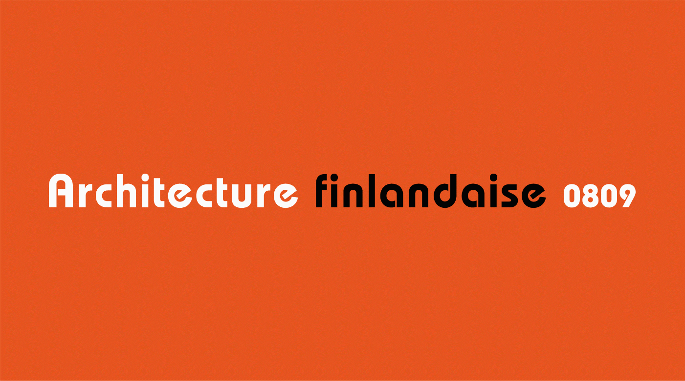
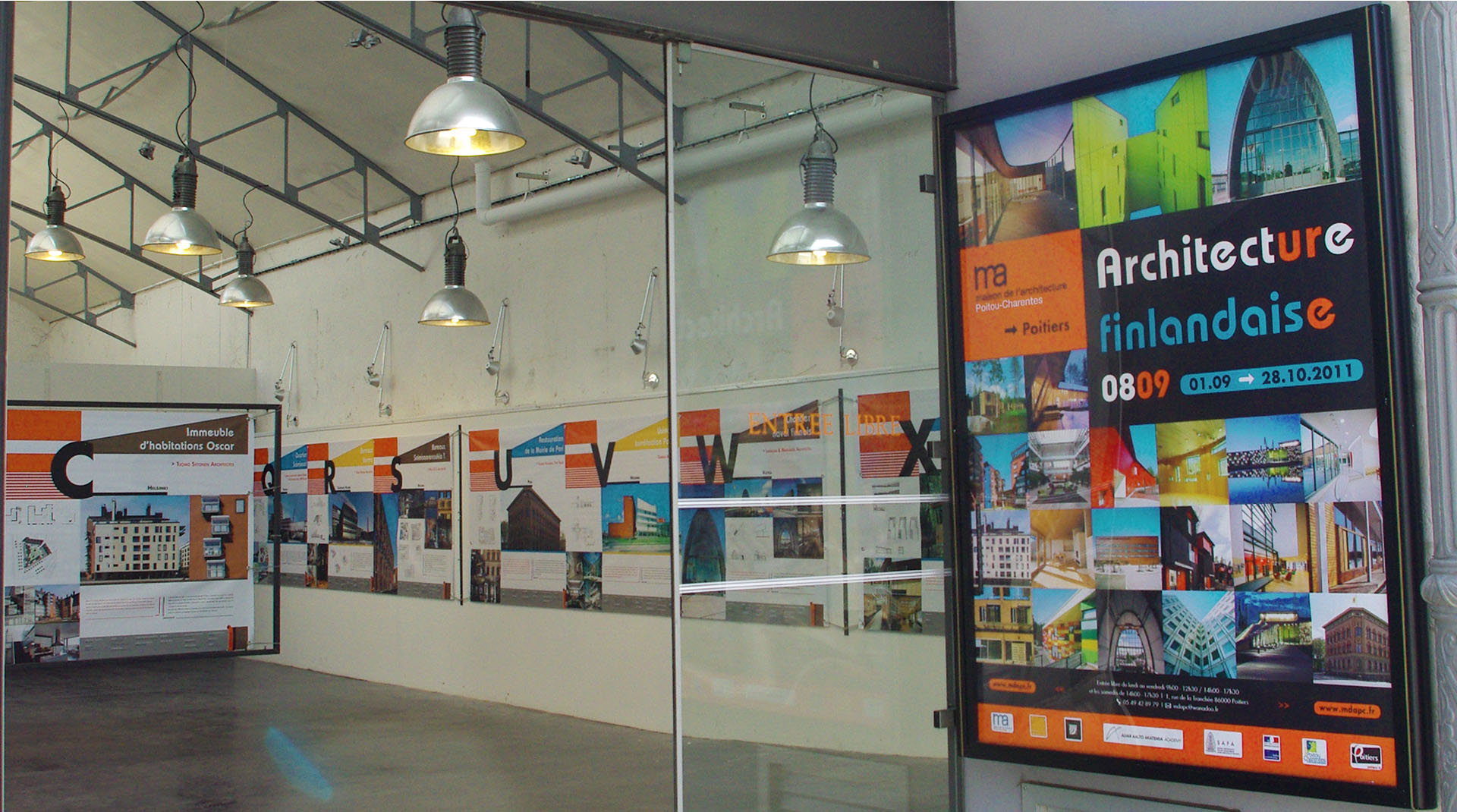
This is an exhibition designed and produced by the Maison de l’Architecture de Poitou-Charentes and in partnership with the Museum of Finnish Architecture et the Alvar Aalto Foundation. It introduces the public to the essence and vitality of Finnish architecture through 27 contemporary projects. The Maison de l’Architecture called on me to manage the creative direction and graphic design of the exhibition.
client
Maison de l’Architecture de Poitou-Charentes
project
architecture exhibition
role
creative direction, design
deliverable
visual identity, digital, print, motion, signage
What are we talking about?
This is an exhibition designed and produced by the Maison de l’Architecture de Poitou-Charentes and in partnership with the Museum of Finnish Architecture et the Alvar Aalto Foundation. It introduces the public to the essence and vitality of Finnish architecture through 27 contemporary projects. The Maison de l’Architecture called on me to manage the creative direction and graphic design of the exhibition.
client
Maison de l’Architecture de Poitou-Charentes
project
architecture exhibition
role
creative direction, design
deliverable
visual identity, digital, print, motion, signage
Creative concept
This sentence by Alvar Aalto “Form must have a content, and that content must be linked with nature.”, symbolizes for me perfectly the modern finnish current in terms of sustainable design, and architecture is a very good example.
My creative direction was therefore to inspire me of this philosophy, in order to transcribe its codes.
In other words, the development of a strong axis around 3 pillars:
Dynamic graphics with pure, simple and geometric shapes;
A set of contrasting but complementary colors;
A structured typography, roundness and no frills, well transcribing the organic aspect. In other words, the nature.
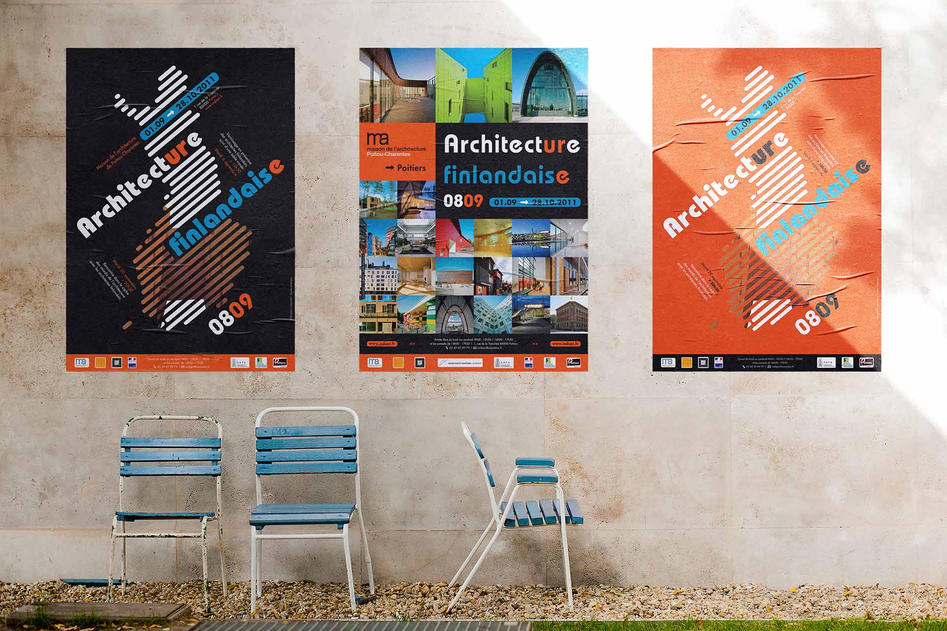
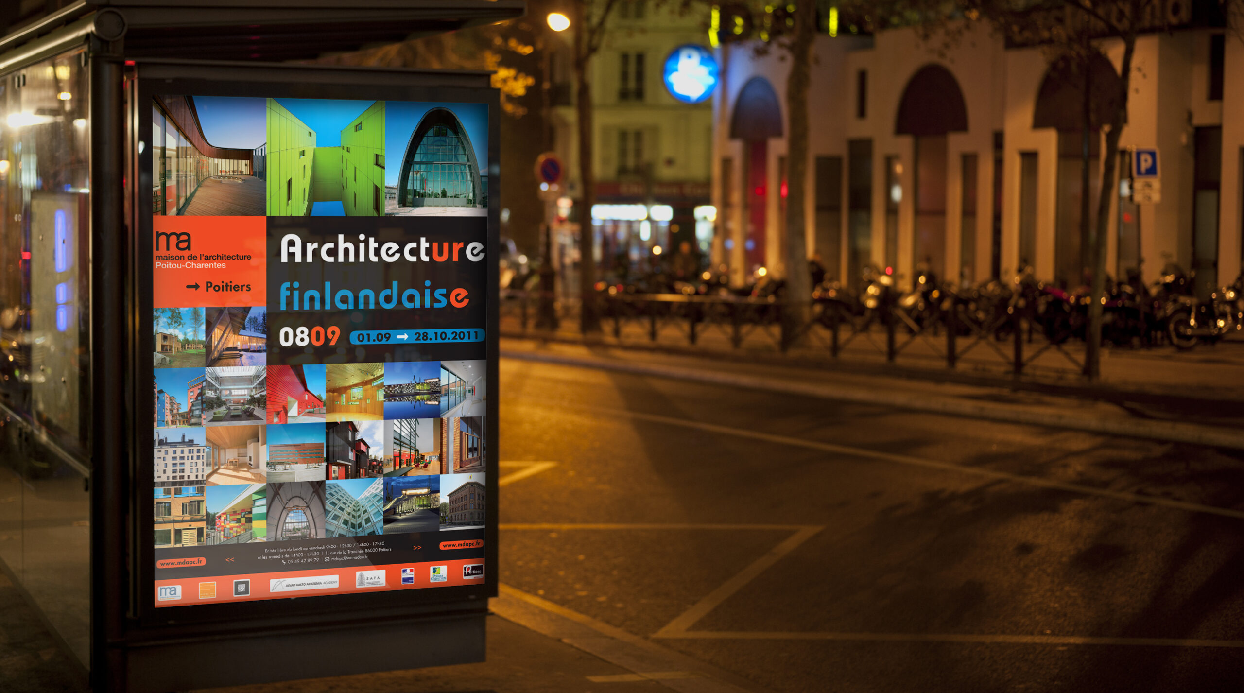
Art direction
The work to be done on the posters was an excellent playground to set up the concept.
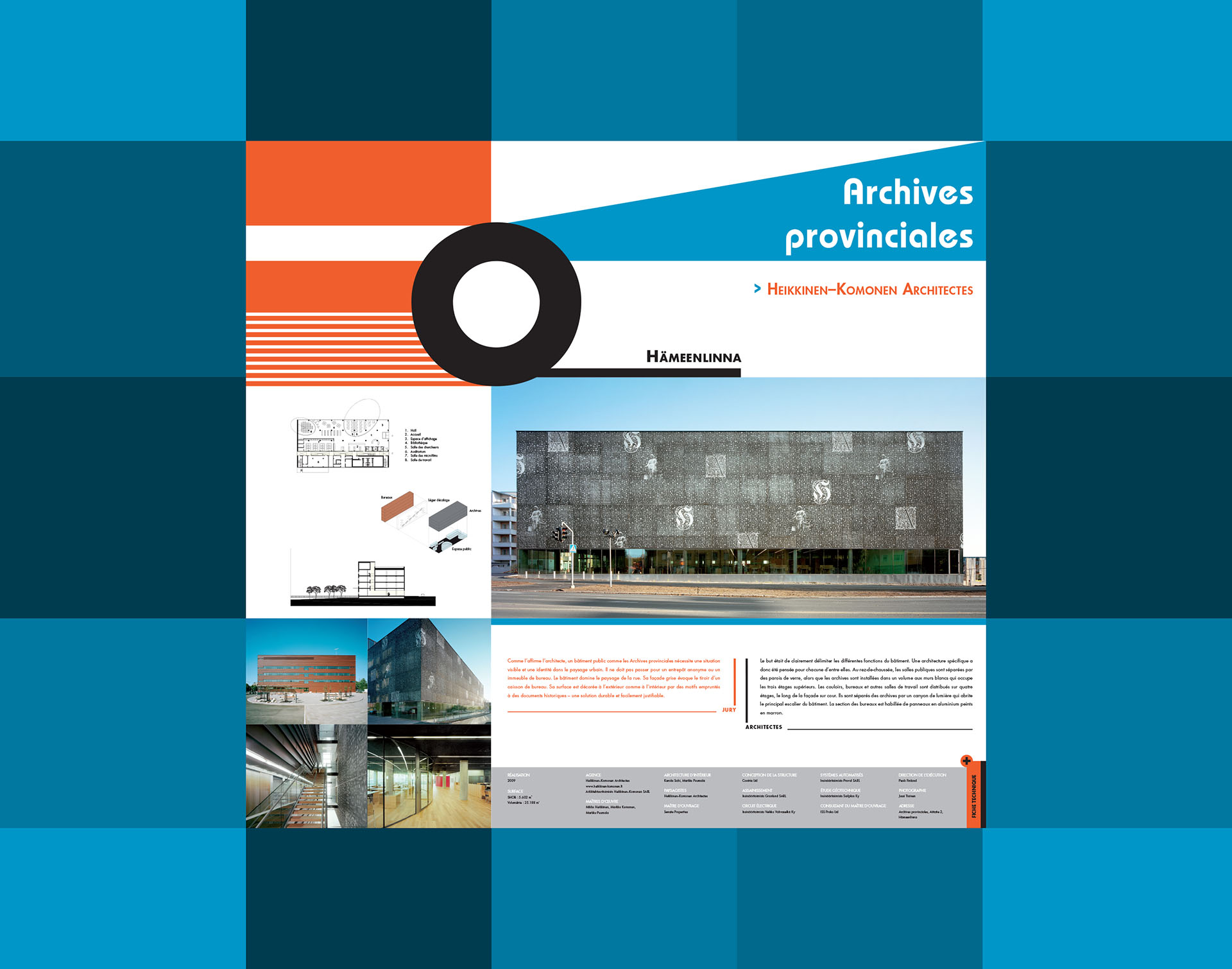
My first proposal was a very concrete orientation of highlighting architectural projects, then a second, more suggestive and graphic. In few words, the first, despite its more conventional look and feel, the complexity was to make the right association choice for each project (framing, viewing angle, color) in order to find a visual and relevant harmony.
The second is a representation of Finnish modernism by graphically illustrating the idea of moving forward.
Art direction
The work to be done on the posters was an excellent playground to set up the concept.
My first proposal was a very concrete orientation of highlighting architectural projects, then a second, more suggestive and graphic. In few words, the first, despite its more conventional look and feel, the complexity was to make the right association choice for each project (framing, viewing angle, color) in order to find a visual and relevant harmony.
The second is a representation of Finnish modernism by graphically illustrating the idea of moving forward.
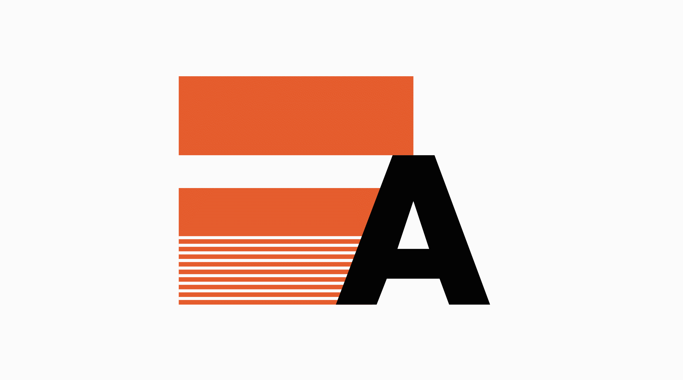
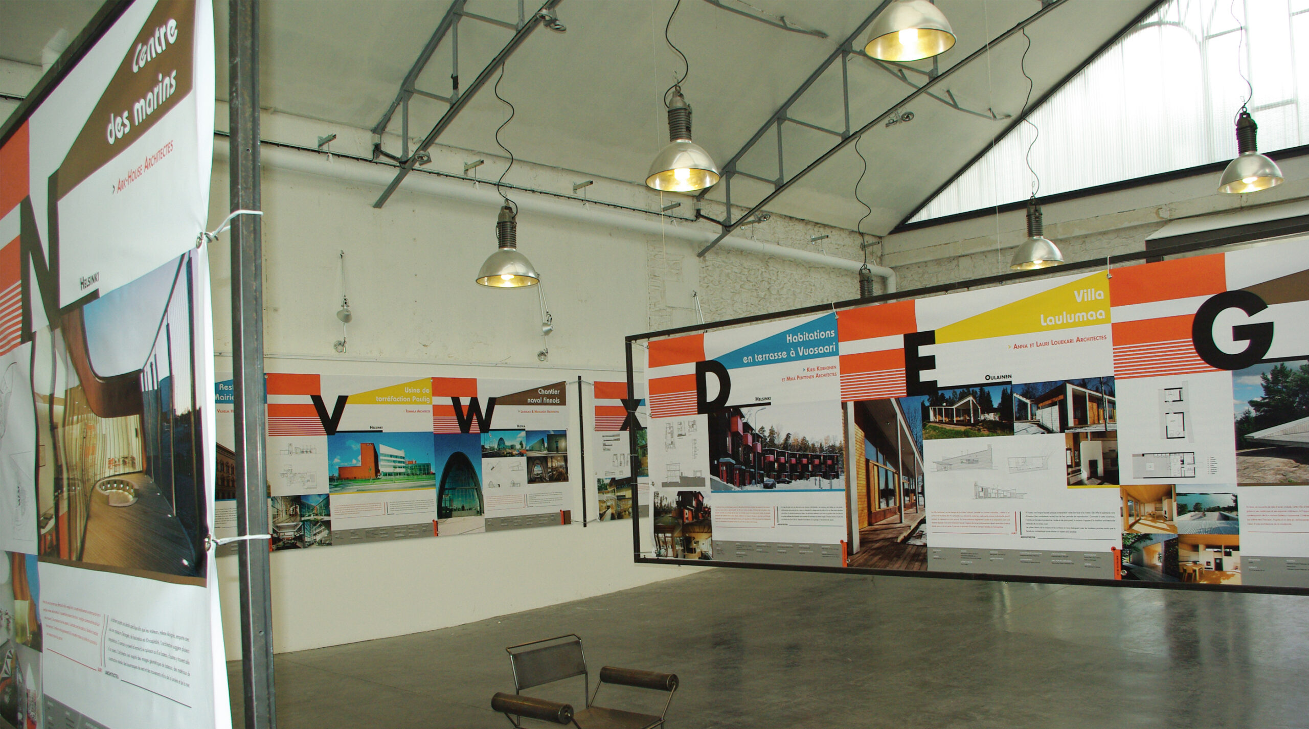
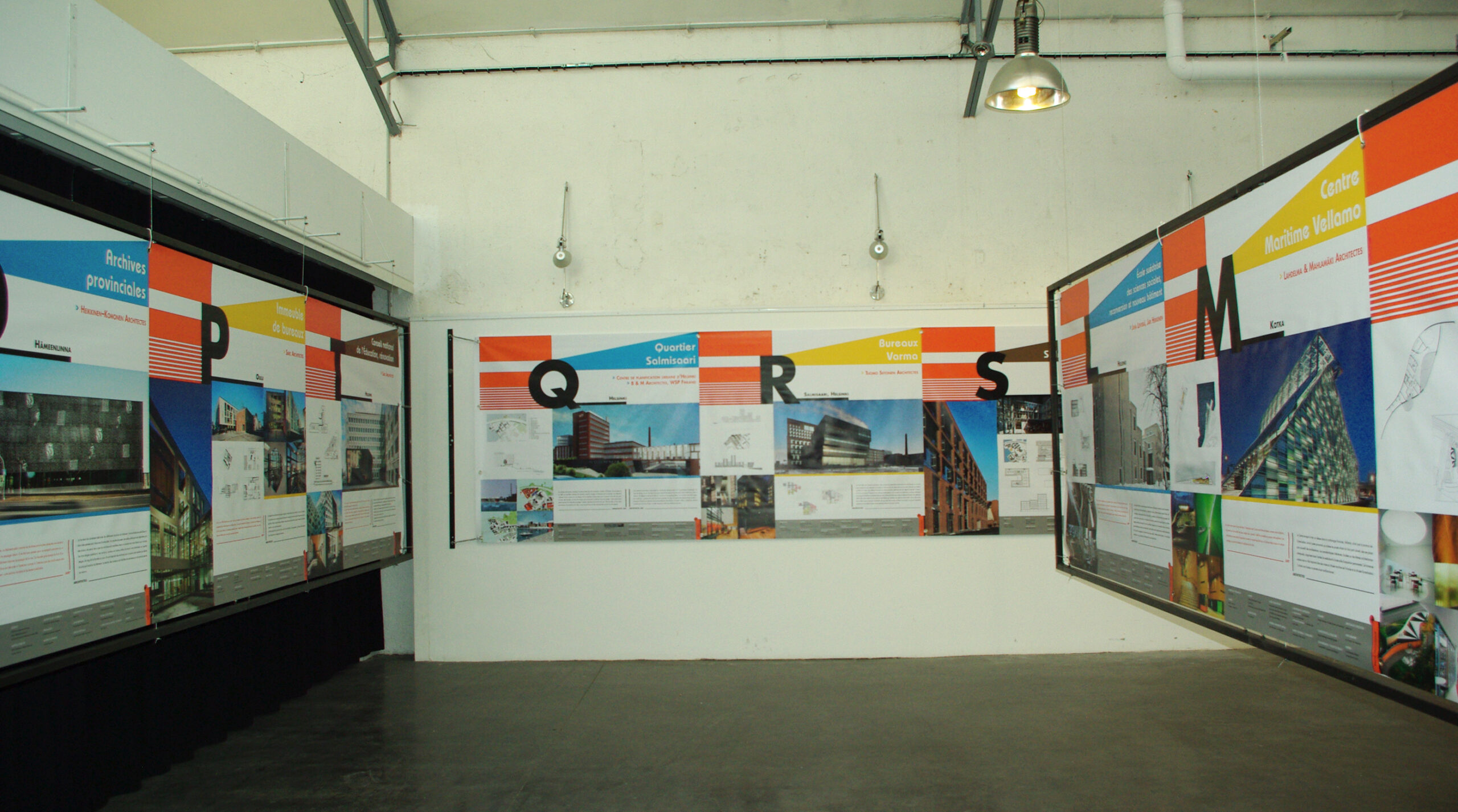
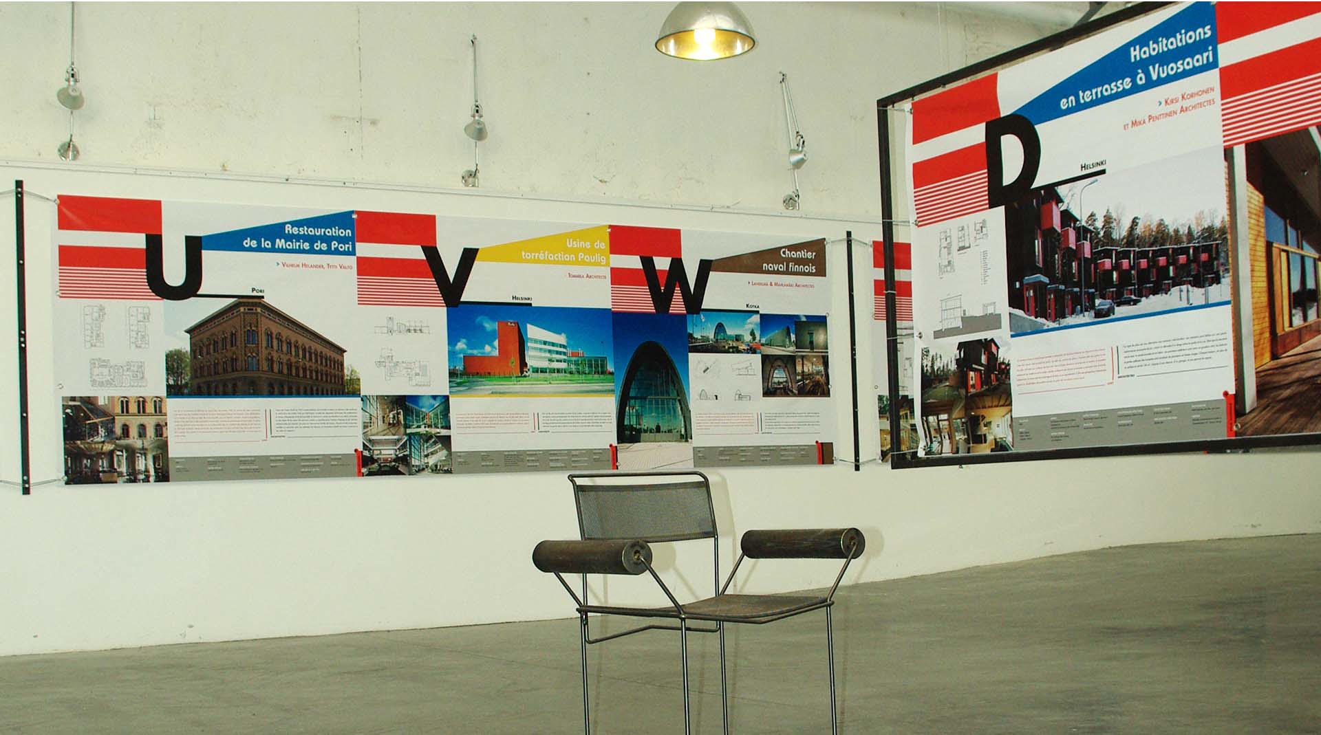
Sceno
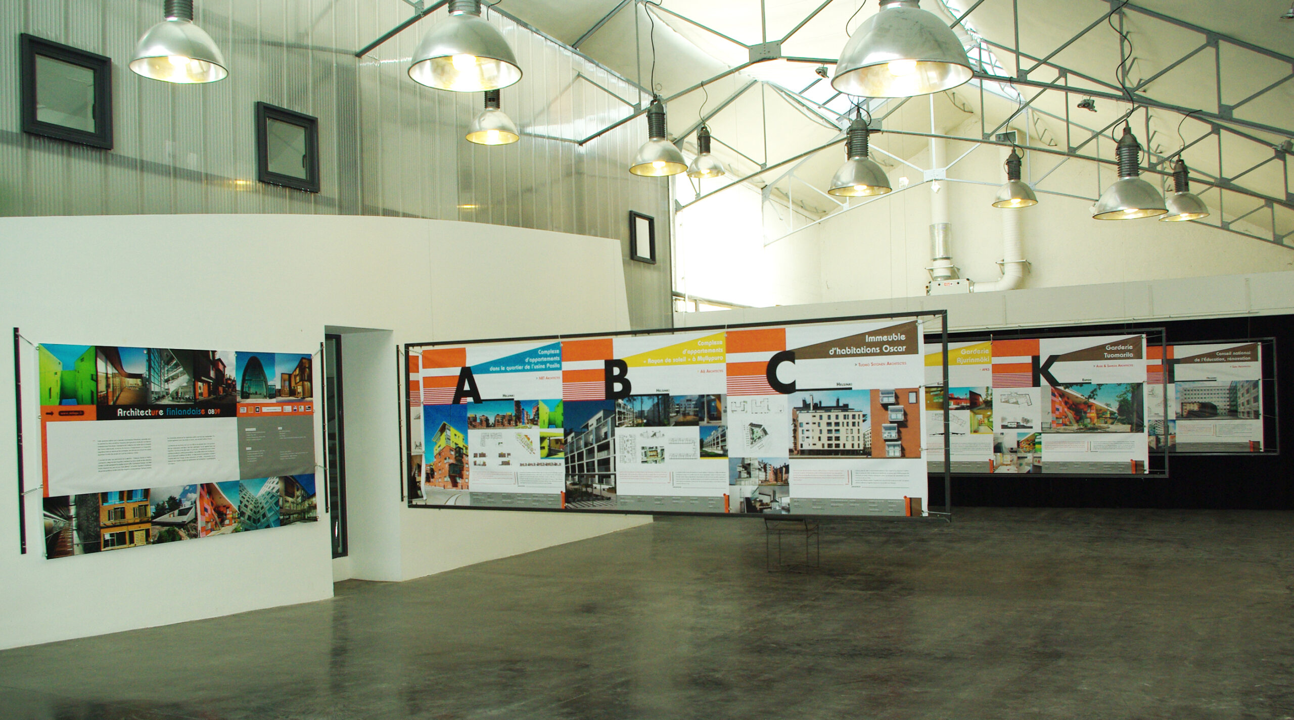
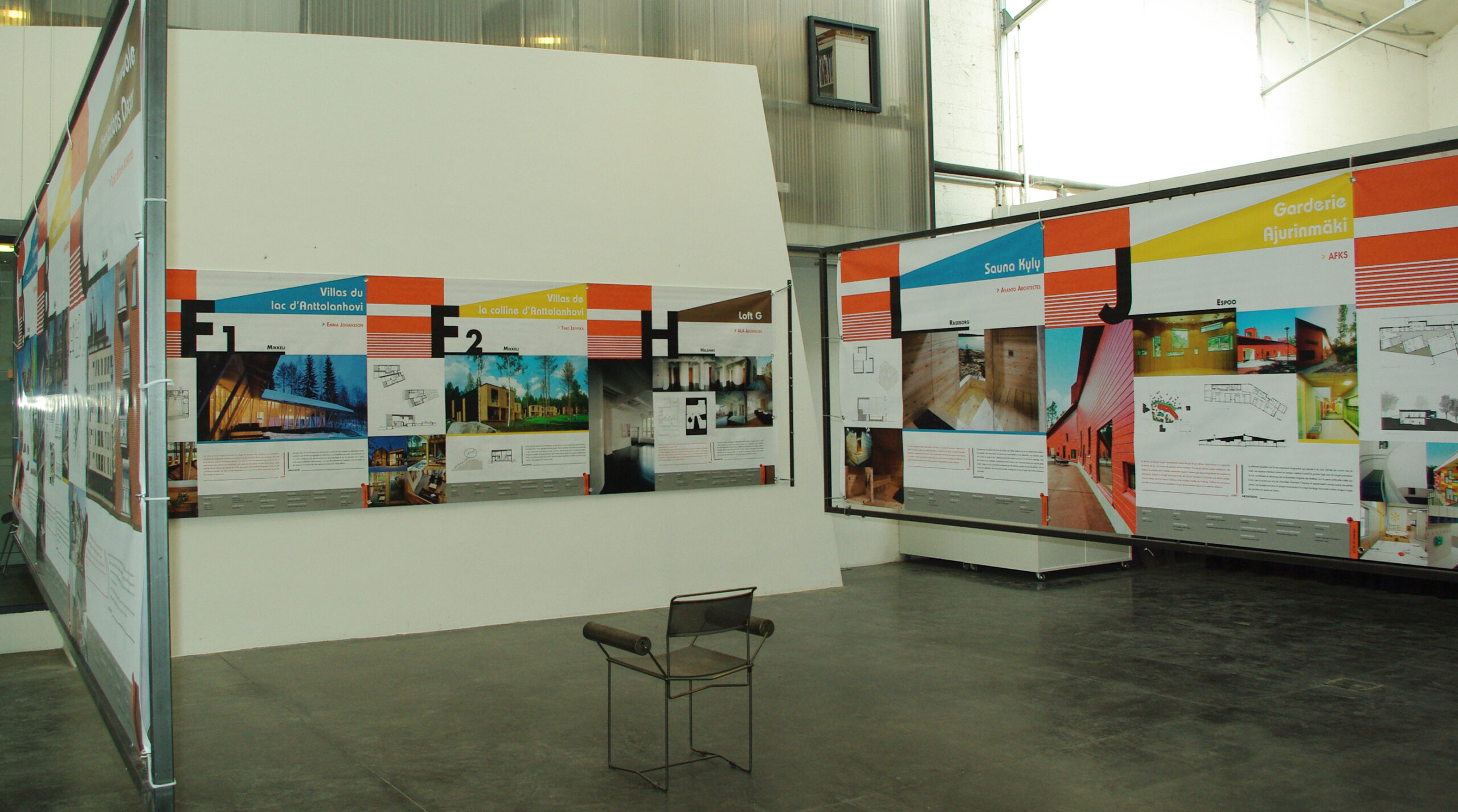
This exhibition consisted of 27 projects each using a letter of the alphabet except for the letter F which was splitted into two projects F1 and F2. This alphabetical classification made it possible quite naturally to set up the sense of the visitor’s journey.
It was therefore important to highlight each letter in such a way as to facilitate its visibility. On this element, I focused both on its position on each panel as well as on its treatment, so as to retain its usefulness in terms of signage, as well as its graphic link with the visual identity of the exhibition.
Each panel has been laid out in the form of a modular grid in order to provide flexibility and rhythm.
Sceno
This exhibition consisted of 27 projects each using a letter of the alphabet except for the letter F which was splitted into two projects F1 and F2. This alphabetical classification made it possible quite naturally to set up the sense of the visitor’s journey.
It was therefore important to highlight each letter in such a way as to facilitate its visibility. On this element, I focused both on its position on each panel as well as on its treatment, so as to retain its usefulness in terms of signage, as well as its graphic link with the visual identity of the exhibition.
Each panel has been laid out in the form of a modular grid in order to provide flexibility and rhythm.
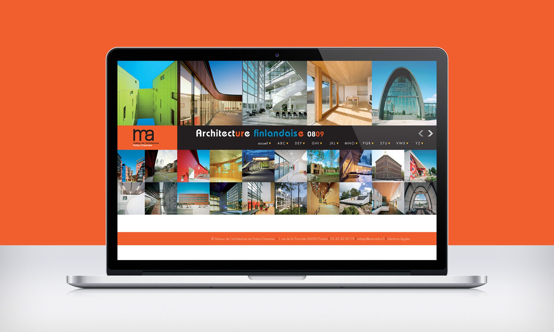
Virtual exhibition
This website was designed to extend the experience of the online visitor journey but also to offer a virtual tour to those who could not come in person. This site was built using WordPress.
Virtual exhibition
This website was designed to extend the experience of the online visitor journey but also to offer a virtual tour to those who could not come in person. This site was built using WordPress.
Credits
Maison de l’architecture de Poitou-Charentes – Académie Alvar-Aalto – Association finnoise des architectes SAFA – Musée de l’architecture finnoise (exhibition curator), Fabien Cros (creative direction / design), Jean-Pierre Ulhen (scenography), Selina Anttinen – Heikki Aitoaho – Johan Celsing – Tapio Aho – Maija Kasvio (Jury), Arno de la Chapelle – Matti Huhtamies – Marko Huttunen – Matti Kallio – Hannu Koivisto – Noritsu Koki – Kai Kuusisto – Antti Laiho – Lauri Louekari – Kalervo Ojutkangas – Kari Palsila, Michael Perlmutter, Kimmo Räisänen – Jyrki Tasa – Jussi Tiainen – Tuomas Uusheimo – Timo Vesterinen – Mika Vuoto (photography)
Maison de l’architecture de Poitou-Charentes – Académie Alvar-Aalto – Association finnoise des architectes SAFA – Musée de l’architecture finnoise (exhibition curator), Fabien Cros (creative direction / design), Jean-Pierre Ulhen (scenography), Selina Anttinen – Heikki Aitoaho – Johan Celsing – Tapio Aho – Maija Kasvio (Jury), Arno de la Chapelle – Matti Huhtamies – Marko Huttunen – Matti Kallio – Hannu Koivisto – Noritsu Koki – Kai Kuusisto – Antti Laiho – Lauri Louekari – Kalervo Ojutkangas – Kari Palsila, Michael Perlmutter, Kimmo Räisänen – Jyrki Tasa – Jussi Tiainen – Tuomas Uusheimo – Timo Vesterinen – Mika Vuoto (photography)